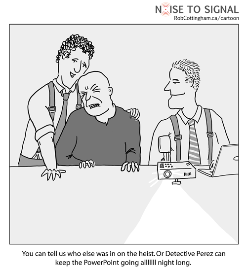
Here it is 2010, and I’m still sitting through godawful, text-heavy PowerPoint presentations with cheesy transitions, pointless clip-art and (pause, Rob, and try to stop hyper-ventilating)… Comic Sans.
Speakers often focus on what it’s like to be giving a presentation, but it’s easy to forget what it’s like to sit through one. Especially the fifth or sixth presentation of the third day of a conference.
You’re sitting in an uncomfortable chair (comfortable conference seating has yet to be invented), probably wired on a combination of carbs and caffeine, quite possibly sleep-deprived from all that late-night networking, and trying to stay alert while passively listening to someone droning on at the front of the room about “paradigms”.
Fortunately, I’m not seeing as many as I did three or four years ago. Word counts are often way down; diagrams are simpler and more effective; and slides, mercifully, take a back seat to the speaker and their story.
Maybe that’s because so many people saw An Inconvenient Truth and were blown away by what Jill Martin and Duarte did… or because of books like Presentation Zen, Beyond Bullet Points and Why Bad Presentations Happen to Good Causes… or just because enough people have been to Beth Kanter‘s presentations.
Whatever the reason, I’m grateful and so, I suspect, are a whole lot of audience members.
(Of course, the state of the art is constantly in flux. And if you want to see where presentations are going, especially in an era of Twitter-enabled audiences who aren’t feeling so passive any more, you could do far worse than reading Cliff Atkinson’s The Backchannel.)


